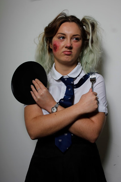
Here are the photos from my wound shoot. I was very pleased with how the application went. I feel as if the wound was a good colour match to Amelia's face, and I felt that I blended it out quite well. However there is still hints of shine where I have not got rid of the glue which I attempted to do but clearly did not do fully.
After the wound went on the larger areas of it started to show; the area on the left is too raised for the skin and looks too big and not thin enough to blend into the skin, however the right side was fine. This has definitely taught me not to make the mould too raised, or rather raised in the right areas and take careful attention to the scraping of the edges as this side had not been scraped enough. It became very obvious when I was applying the wound.
I was very pleased with how the texture of the actual scrapes came out, as to me it looks like fresh, torn flesh, and at the end of the wound are the scrapes that were not as hard on the face.
Overall I am disappointed with how high the wound is on the left side of the face. however now I know what not to do when creating my human/animal hybrid.
I was pleased with how the characterisation came out in these shots, I think that the fact that she is a schoolgirl that has got into a fight is quite obvious. I also like how the MAC Shine mixing medium shows up clearly and gives a crying effect. I also used this on the bottom lashes to get them to stick together, as this is an effect that happens when a person cries.


No comments:
Post a Comment